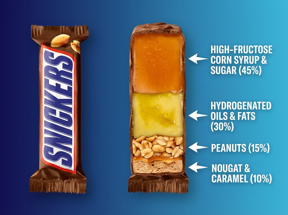
Using the provided reference image, create a bold, startup-style social media visual that highlights the overwhelming presence of harmful ingredients in the product.

The composition shows a side-by-side comparison of the same product:

On the left:
The product exactly as shown in the reference image, intact, clean, and familiar in appearance.

On the right:
The same product at the exact same size, proportions, and perspective, but sliced or cut open to expose its internal composition as clearly separated horizontal layers.

The internal layers should visually emphasize imbalance:
the largest and most dominant layers represent harmful or low-quality ingredients, while beneficial ingredients appear noticeably smaller and minimal.

Use thin, sharp arrows pointing to each layer.
Next to each arrow, include clear, modern text labels stating:

the ingredient name

the approximate percentage or proportion

Design the visual hierarchy so that high-sugar and high-fat components feel visually heavy and excessive, creating an immediate sense of concern and contrast.

Design style:
Minimal, high-contrast startup infographic aesthetic.
Clean sans-serif typography, bold spacing, strong contrast.
Crisp studio lighting, exaggerated layer separation for clarity and impact.
Flat or softly graded background inspired by modern tech and startup visuals.